While building this website, I tested it for accessibility and performance - here’s what I found using axe DevTools and Lighthouse.
I found out about axe DevTools at the #MCRTechConnect recently, and wanted to try it out alongside Lighthouse to test for accessibility.
I ran the tests on each page of my website first using both tools, making notes of the corrections. I didn’t implement any corrections until after I had tested with both tools so I could compare the results fairly.
What the tests picked up & I fixed straight away:
- The social media icons with links in my footer weren’t labelled correctly for screen readers. → I added aria labels to make the icon links identifiable.
- An errant img tag on one of the article pages, the test picked up that the tag didn’t have any alt text. This was actually in the text body of the article, and ironically I was writing about the importance of using alt tags for images…. → I reformatted it so it wouldn’t be read as an img tag.
- Links were too close together, which could cause issues for users to be able to tap them to navigate. → increased the spacing between links.
- Meta descriptions were missing on some pages, which impacts the SEO (search engine optimisation) → added meta descriptions
Most of the above improvements were mistakes the tools helped me pick up which will ultimately make my website better for all users, not just disabled users.
A few items I chose to fix later, most of these impacted the performance slightly rather than accessibility:
- I used a Font Awesome library for my social media icons. This was picked up in the performance section because it slowed down the load time for my page. I will consider this more in the future when building websites, and will later replace the library with images for the icons.
- I’ll need to resize a few images
- Images would load faster with next gen file formats like WebP / AVIF instead of PNG / JPEG → I’ll bear this in mind when adding images in the future.
There are also a few issues the tools picked up on that I knew I could ignore. For example, axe DevTools picked up on a script from Ghostery from the browser at my end.
A few pros and cons, bearing in mind I’m comparing the free versions of both tools:
Lighthouse:
✔️ Easy and intuitive to use✔️ Shows test scores as a percentage for performance, accessibility, best practices, and SEO.
✔️ Can look at previous reports
✔️ Can choose to test for desktop vs mobile
✔️ Already installed in Chrome browser developer tools (hit Ctrl + I +Shift), minimal setup!
➖ Suggested solutions and reasons to make changes were less detailed than axe DevTools
Axe DevTools
✔️ Categorised issues into severity to help prioritise✔️ Picked up on more issues than Lighthouse
✔️ More detailed solutions - this helped me decide how to solve issues
➖ Free version is more limited than Lighthouse and fewer options available
Overall, both tools were easy to use, and I definitely recommend testing with them or similar before launching a website.
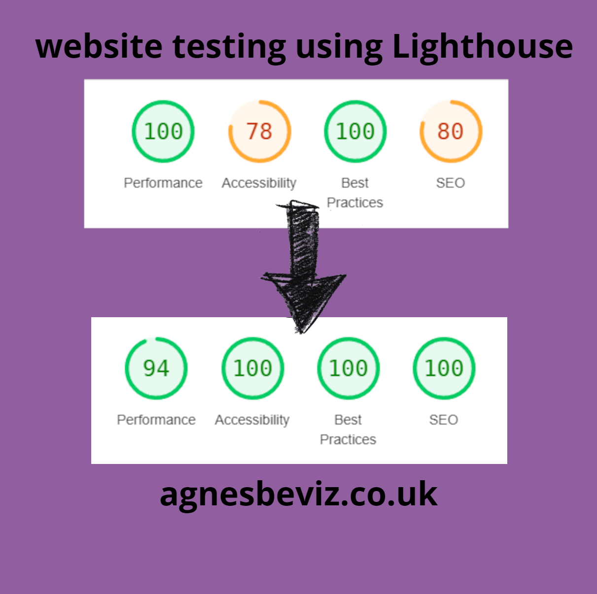
The test scores in the image are for one of the article pages, and the results are similar across all the pages on the website, with variation for mobile.
I’m pleased with the result, but also am aware that it would be much more difficult to get a more complex website to a high accessibility score!